Proxy Mode
While drag and drop is nice, there are cases where it's impossible to render a DOM structure that works with blökkli's drag and drop interactions. Examples include:
- Image sliders, carousels
- Interactive components that render only one nested block at a time
To solve this you can enable "proxy mode" on a <BlokkliField>. By doing so:
- The
<BlokkliField>component won't render any nested components - During editing, it will render a proxy list of the entire nested structure
- This proxy list is displayed as an overlay with
position: absolute - If any block is selected the proxy list is displayed
Enable Proxy Mode
Set the proxy-mode prop to true.
<template>
<div class="relative">
<BlokkliField v-slot="{ items }" name="slides" :list="slides" proxy-mode>
<Carousel>
<BlokkliItem v-for="item in items" v-bind="item" />
</Carousel>
</BlokkliField>
</div>
</template>
<script lang="ts" setup>
import type { FieldListItemTypedArray } from '#blokkli/generated-types'
import { defineBlokkli } from '#imports'
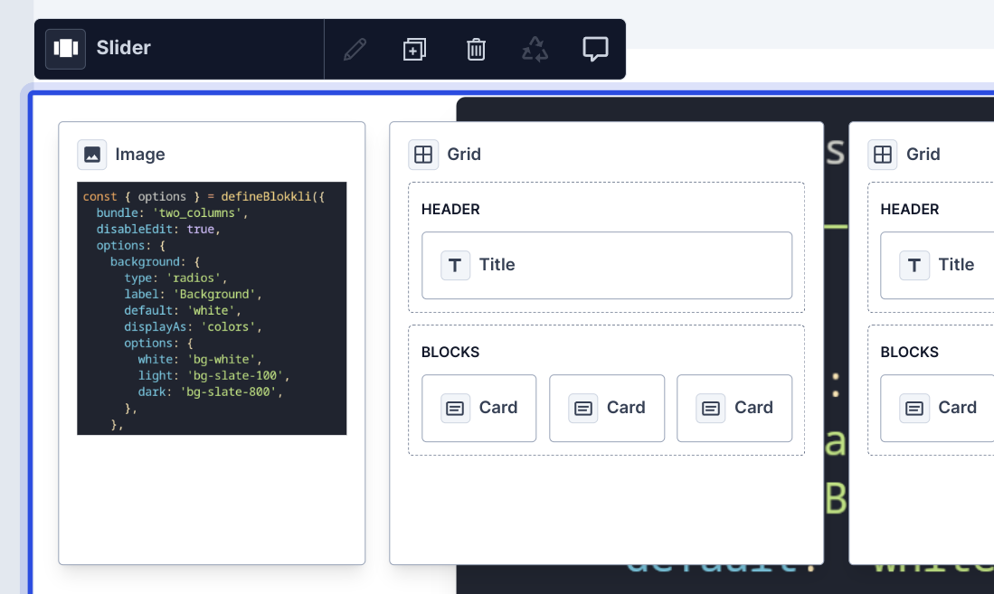
defineBlokkli({
bundle: 'slider',
})
defineProps<{
slides: FieldListItemTypedArray
}>()
</script>Once proxy mode is enabled you will have to manually render the nested blocks of the field, as is being done in the <Carousel> component in this example. You may use <BlokkliItem> to render a block or directly render components however you wish.
Proxy Component (proxy.vue)
By default blökkli renders a simple structured view of the entire nested structure of the field. Each nested block renders its block type label and, if available, additional nested fields.
However, in cases like image carousels, it might be useful for the user to see a bit more context than just the name of the block. To solve this you can implement a proxy component that is displayed in addition to the label.
To do this, create a proxy.vue file in the same directory as your main block component. This file must not use the defineBlokkli composable.
To continue with our image carousel example, if you have an image block in ~/components/Blokkli/Image/index.vue, create a file called proxy.vue in the same directory.
<template>
  <div v-blokkli-droppable:imageSrc>
    <img :src="imageSrc" />
  </div>
</template>

<script lang="ts" setup>
const props = defineProps<{
  imageSrc: string
}>()
</script>
Now, when our image block is rendered inside a field with proxy mode, blökkli will use the proxy.vue component to display some additional markup.
The component will receive the same props as the main block component. However it does not have access to the usual context (such as uuid) or any of the options defined in your main block component. You may still annotate elements using the v-blokkli-droppable or v-blokkli-editable directives to make them editable in the editor.
It's recommended to keep the contents of the proxy.vue component simple. In particular, keep in mind that the available width can be quite limited, so try to keep the width and height of the rendered markup as small as possible.