Defining block options
While the actual data of a block (passed in via props) is entirely handled by your app, the options are managed by blökkli. Options are directly defined in the component.
One important thing to note is that the data for the options is always stored as strings. For example, the value of a checkbox is stored as '1' or '0' and the value of the checkboxes type is stored as 'one,two,seven'.
The returned object from defineBlokkli() contains the options property which is a reactive computed property of the options for this component.
IMPORTANT
Because defineBlokkli is a compiler macro, you can not access variables from outside the composable. This means you can't do something like this:
const translations = useTranslations()

const { options } = defineBlokkli({
  bundle: 'card',

  options: {
    box: {
      type: 'checkbox',
      label: translations.boxOptionLabel,
      default: false,
    },
  },
})
Checkbox

This is the simplest option. It renders a single checkbox with the given label.
<script lang="ts" setup>
const { options } = defineBlokkli({
  bundle: 'card',

  options: {
    box: {
      type: 'checkbox',
      label: 'Mobile',
      default: true,
    },
  },
})

// Either true, false or undefined.
console.log(options.value.box)
</script>
Checkboxes
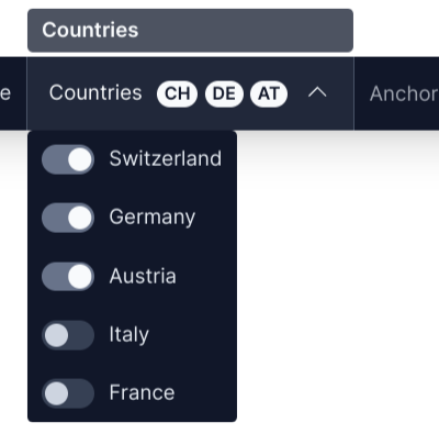
This will render multiple checkboxes in a dropdown where zero or multiple options can be checked.
In this example we provide an option to select in which countries the block should be displayed.
<script lang="ts" setup>
const { options } = defineBlokkli({
  bundle: 'card',

  options: {
    countries: {
      type: 'checkboxes',
      label: 'Countries',
      default: ['ch', 'de', 'at'],
      options: {
        ch: 'Switzerland',
        de: 'Germany',
        at: 'Austria',
        it: 'Italy',
        fr: 'France',
      },
    },
  },
})

// An array of valid options, e.g. ['ch', 'at', 'it'].
console.log(options.value.countries)
</script>
Text

This option renders a single text input.
In this example we implement a text option where editing users can provide an ID/slug that our component can use as it's root ID attribute.
<script lang="ts" setup>
const { options } = defineBlokkli({
  bundle: 'card',

  options: {
    anchorId: {
      type: 'text',
      label: 'Anchor ID',
      default: '',
      inputType: 'text',
    },
  },
})

// The text entered by the user as a string, e.g. 'contact-form'.
console.log(options.value.text)
</script>
Color
This option type renders a HTML color input. The resulting value is a 6-digit HEX color string with a # prefix, e.g. #f83b42.
<script lang="ts" setup>
const { options } = defineBlokkli({
  bundle: 'card',

  options: {
    backgroundColor: {
      type: 'color',
      label: 'Background Color',
      // The default value must be a valid HEX color.
      default: '#000000',
    },
  },
})
</script>
Radios
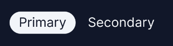
This option renders a group of radio buttons.
<script lang="ts" setup>
const { options } = defineBlokkli({
  bundle: 'button',

  options: {
    buttonType: {
      type: 'radios',
      label: 'Button Type',
      default: 'primary',
      options: {
        primary: 'Primary',
        secondary: 'Secondary',
      },
    },
  },
})

// The selected option, either 'primary' or 'secondary'.
console.log(options.value.buttonType)
</script>
It's possible to change how the radio buttons are rendered using the displayAs property.
displayAs: 'radios'
This is the default behaviour and it renders all options inline using the defined label.
displayAs: 'grid'

This renders each option as a grid. Instead of a string label the value should be the columns of the grid, expressed as flex-grow values.
Each option key can have different amounts of columns.
In this example we provide an option where, in a two column grid, the width of both columns can be selected.
<script lang="ts" setup>
const { options } = defineBlokkli({
  bundle: 'two_columns',
  options: {
    columns: {
      type: 'radios',
      label: 'Columns',
      default: 'equal',
      displayAs: 'grid',
      options: {
        equal: { columns: [1, 1], label: 'Equal' },
        oneTwo: { columns: [1, 2], label: 'One / Two' },
        twoOne: { columns: [2, 1], label: 'Two / One' },
      },
    },
  },
})
</script>
displayAs: 'colors'

This will render a circle with the given HEX color as the background.
<script lang="ts" setup>
const { options } = defineBlokkli({
  bundle: 'button',
  options: {
    color: {
      type: 'radios',
      label: 'Color',
      default: 'white',
      displayAs: 'colors',
      options: {
        normal: { class: 'bg-white', label: 'White' },
        primary: { class: 'bg-accent-700', label: 'Primary' },
      },
    },
  },
})
</script>
displayAs: 'icons'

This will render the given icon for each option. The icons have to be in the same folder as the component and are referenced by their file name (all lowercase, only a-z, - and _ are allowed). The file name must start with icon-blokkli-.
In this example we have the following file structure:
- components/
  - Blocks/
    - Grid/
      - index.vue
      - icon-blokkli-option-two.svg
      - icon-blokkli-option-three.svg
- icon-blokkli-option-four.svg<script lang="ts" setup>
const { options } = defineBlokkli({
bundle: 'grid',
options: {
columns: {
type: 'radios',
label: 'Columns',
default: 'two',
displayAs: 'icons',
options: {
two: { icon: 'icon-blokkli-option-two', label: 'Two' },
three: { icon: 'icon-blokkli-option-three', label: 'Three' },
four: { icon: 'icon-blokkli-option-four', label: 'Four' },
},
},
},
})
</script>Range
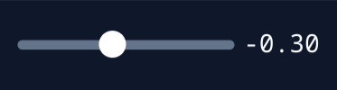
Renders a HTML range input to select a single numeric value.
<script lang="ts" setup>
const { options } = defineBlokkli({
  bundle: 'badge',

  options: {
    rotation: {
      type: 'range',
      label: 'Rotation',
      default: 0,
      min: 0,
      max: 360,
      step: 1,
    },
  },
})

// A valid (not NaN) number.
console.log(options.value.rotation)
</script>
Number

Renders a HTML number input to enter an integer number.
<script lang="ts" setup>
const { options } = defineBlokkli({
  bundle: 'badge',

  options: {
    rows: {
      type: 'number',
      label: 'Rows',
      default: 3,
      min: 0,
      max: 8,
    },
  },
})

// A valid (not NaN) number.
console.log(options.value.rows)
</script>
Grouping
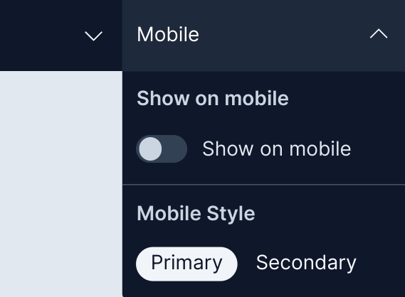
If your block defines a lot of options the horizontal space available might not be enough. To solve this, you can group options into a dropdown.
To do this, just define the desired group label using the group property when defining options:
const { options } = defineBlokkli({
  bundle: 'card',

  options: {
    showOnMobile: {
      type: 'checkbox',
      label: 'Show on mobile',
      default: false,
      group: 'Mobile',
    },

    mobileStyle: {
      type: 'radios',
      label: 'Mobile Style',
      default: 'primary',
      group: 'Mobile',
      options: {
        primary: 'Primary',
        secondary: 'Secondary',
      },
    },
  },
})